Mario Badescu Rebrand
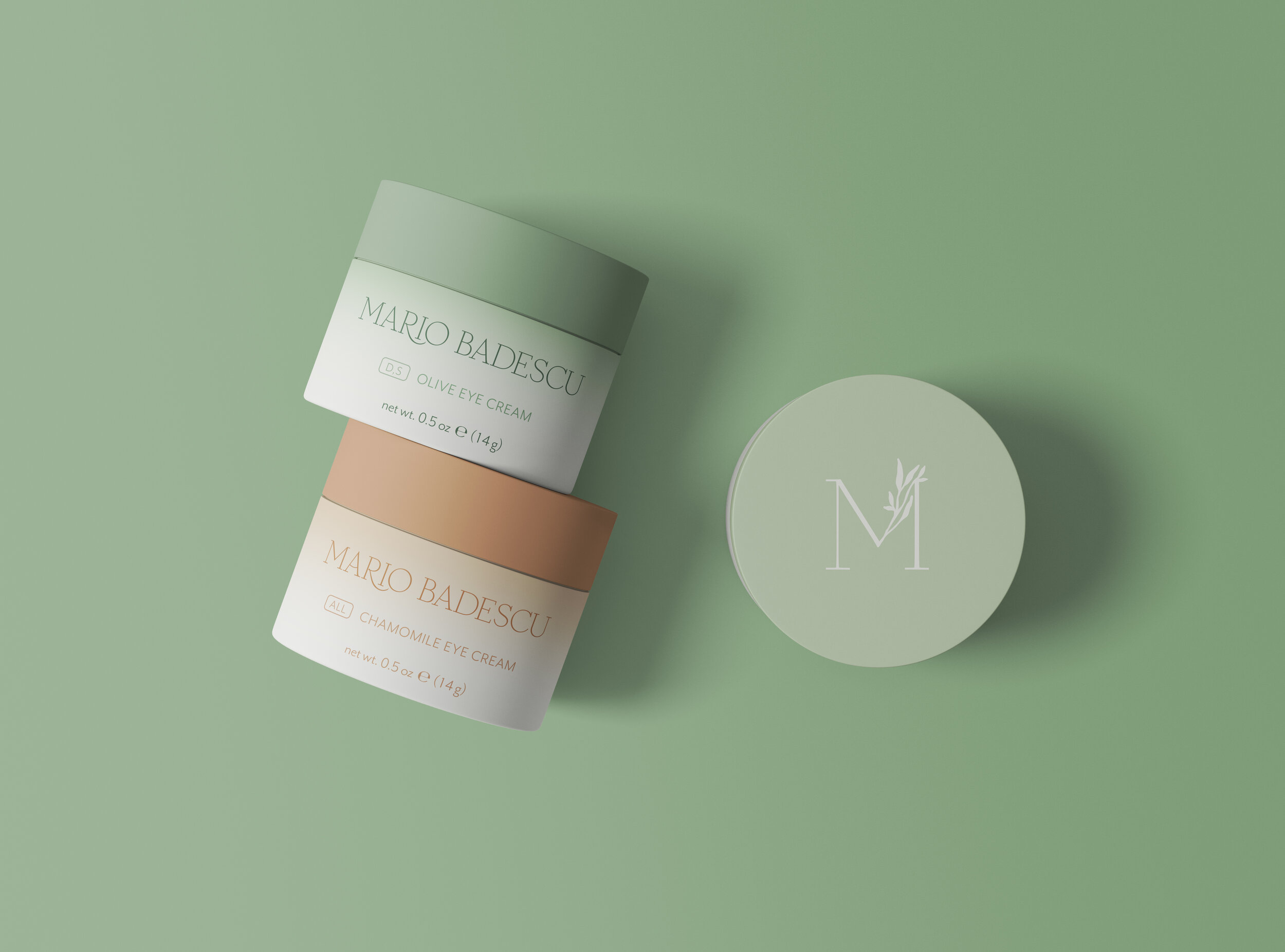
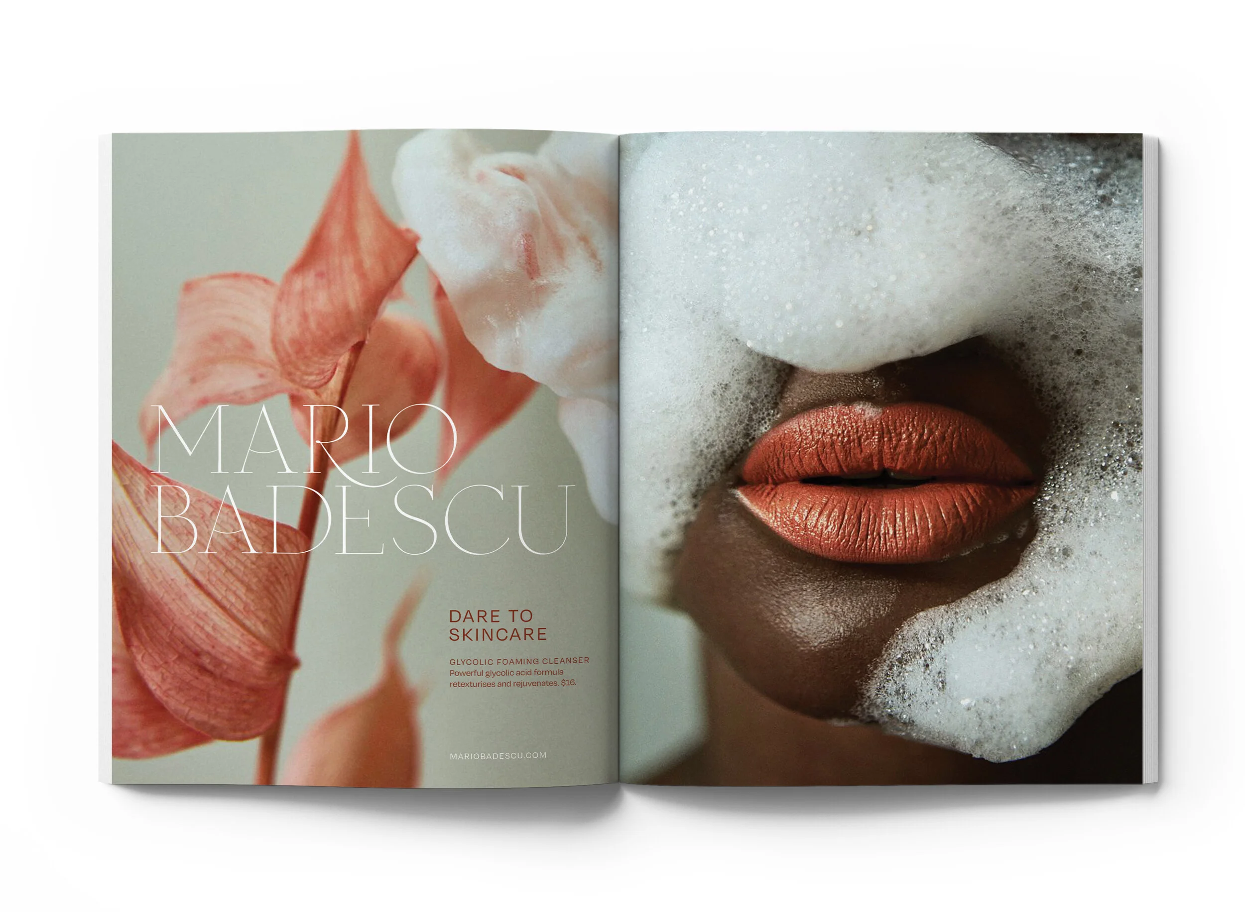
For this rebrand of Mario Badescu skincare, I sought to refresh their look into something more elegant and elevated. Mario Badescu is on the less expensive and more accessible end of the skincare world, but that doesn’t mean it has to look cheap. Skincare should be a luxurious and enriching part of the daily routine. My favorite part of the rebrand are the magazine advertisements, which draw a connection between the ingredients, the product, and the user.
Lesson Learned: Embracing My Instincts
A lot of young artists and designers worry about “finding their style.” One of my mentors would respond to that by saying, “You don’t have a style, and you shouldn’t right now. You have preferences.” That being said, it’s been pointed out to me before that I have a preference for all-caps delicate serif typefaces, and it was making my portfolio look one-dimensional. I appreciated the feedback as it has helped me branch out and develop my portfolio. At the same time, however, I’ve needed to learn to trust my instincts, even if they are all-caps serif, when it is the right choice for the project.
Photographer credits: Cecilie Jegsen, Linus Morales, Miguel Bruna


